Data Exploration
I am reviewing some basic topics in data science to regresh my memory. These are my notes.
.corr()
We will demonstrate a set of basic data analysis functions from Pandas using the toy Boston housing dataset. I chose this dataset since it comes from sklearn and can be reproduced easily. First, I will demonstrate .corr().
import pandas as pd
from sklearn.datasets import load_boston
%matplotlib inline
boston = load_boston()

# create dataframe
df = pd.DataFrame(boston['data'], columns=boston['feature_names'])
df['MEDV'] = boston['target']

# choose only 2 predictor variables plus target
df = df[['CRIM','DIS','MEDV']]

df.head()
| CRIM | DIS | MEDV | |
|---|---|---|---|
| 0 | 0.00632 | 4.0900 | 24.0 |
| 1 | 0.02731 | 4.9671 | 21.6 |
| 2 | 0.02729 | 4.9671 | 34.7 |
| 3 | 0.03237 | 6.0622 | 33.4 |
| 4 | 0.06905 | 6.0622 | 36.2 |
Features
- CRIM - per capita crime rate by town
- DIS - weighted distances to five Boston employment centres
Target
- MEDV - Median value of owner-occupied homes in $1000’s
Let’s take the correlation with the target variable.
# correlation
df.corr()
| CRIM | DIS | MEDV | |
|---|---|---|---|
| CRIM | 1.000000 | -0.379670 | -0.388305 |
| DIS | -0.379670 | 1.000000 | 0.249929 |
| MEDV | -0.388305 | 0.249929 | 1.000000 |
Conclutions:
- Crime has negative correlation with median home value, because higher crime drives down home values.
- Distance-to-jobs has positive correlation with median home value, which might be surprising. Intuitively, people prefer shorter commutes. One explanation is people prefer the space of suburban homes over urban homes, despite the longer commutes.
Next, I will show scatter_matrix()
scatter_matrix()
Plots pairwise scatter plots, with univariate histograms on the diagonal.
pd.plotting.scatter_matrix(df);
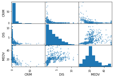
Conclusions:
- Note the top-middle plot of Crime with distance-to-jobs. The high-crime areas seem to be close to job centers.
- In the bottom-left, the highest value houses are located in low-crime areas, which makes sense.
.hist()
This plots histograms or each column.
df.hist();
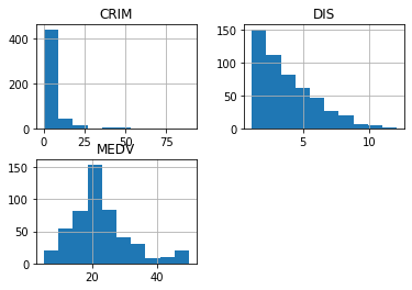
Observations:
- For MEDV, there are a small number areas of high-value homes (right tail).
- Distance-to-jobs has many areas that are close to jobs, then gradually trails off to areas that are far-from-jobs. This makes sense when jobs are in dense urban centers, and density slowly drops as you move away.
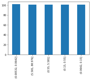
.bar()
Represent categorical data with vertical bars with lengths proportional to the values they represent.
First, I will bin the Crime variable by quintiles. Then I will count the frequency, then plot using .bar(). Since I’m taking quintiles, each bin will have the same frequency count.
print(pd.qcut(df.CRIM, 5).value_counts())

pd.qcut(df.CRIM, 5).value_counts().plot.bar();
(0.00532, 0.0642]    102
(5.581, 88.976]      101
(0.55, 5.581]        101
(0.15, 0.55]         101
(0.0642, 0.15]       101
Name: CRIM, dtype: int64